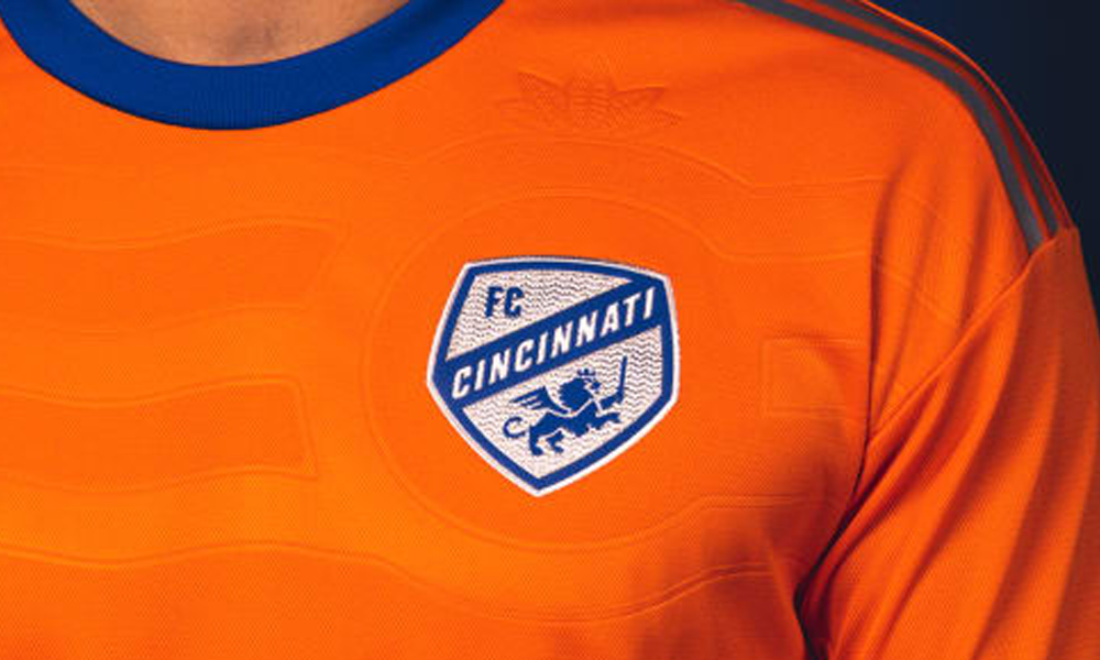
FC Cincinnati finally revealed its newest away kit for the 2022 and 2023 seasons on Friday. It was the team’s first orange kit during its time in Major League Soccer.
This was a color choice that was long-awaited by fans, and for good reason. Orange has long been a secondary part of many of the team’s best jerseys and it was shocking it took Adidas this long to make it the primary color of a top.
For that matter, the shade of orange is a great one. It could have been too light or too dark, but it wasn’t. I loved this choice of orange and it works perfectly well with the sparing choice of blue.
I think the blue neck and sleeve collars are also great and stick out amazingly well with the rest of the kit’s orange shade. I think the blue sleeves, would have looked more pleasing if they wrapped all the way around the arm. The blue and silver/white also look outstanding on the crest and make it stick out very well.
The most interesting part of the kit might be the flag that is lightly shaded into the chest. I think this aspect of the kit separates it from many other kits on the market and makes it feel purely Cincinnati.
One thing that mightily hurts this kit’s design, however, is the overuse of the silver in multiple areas. The writing on the front of the kit is difficult to read. I haven’t yet seen the back of the kit so I cannot comment on that aspect.
The shoulder stripes are to me the most disappointing part of the kit. I think the same shade of blue as the two collars would have been a better choice and aesthetically pleasing.
However, that isn’t the only problem with them. The fact of the matter is that they appear cheaply made compared to previous shoulder stripes. Just look at the home kit. Those shoulder stripes were actually stitched and make the stripes pop. The screen-printed aspect of the shoulder stripes just makes me wish they hadn’t even added that part to the kit.
This new away kit is one of the most unique kits the team has ever offered. It has parts that are really interesting, but it isn’t perfect. But that just makes me more intrigued because it shows the designers are actually trying instead of using easy templates.
Recommended for you