Last-Columbus Crew SC
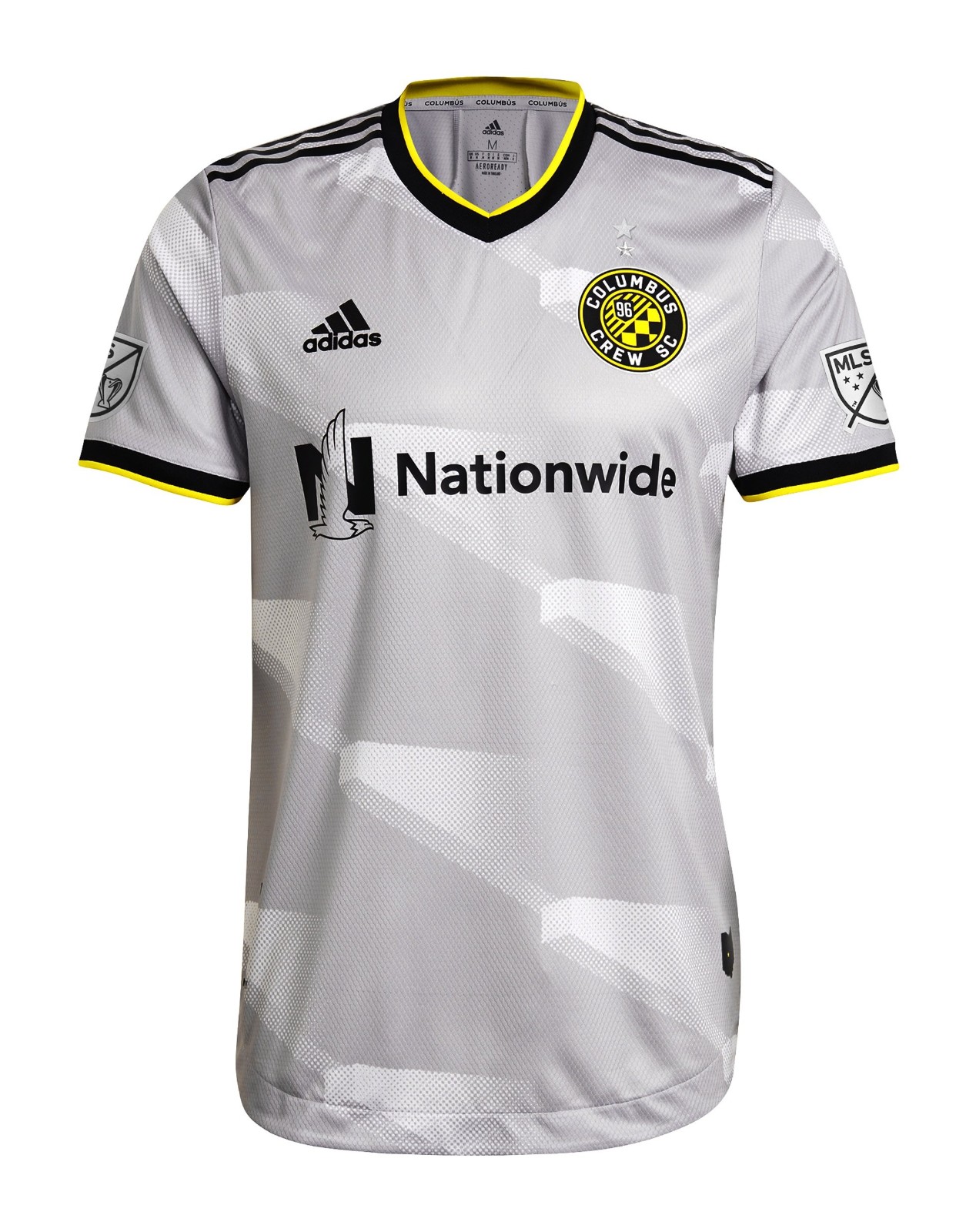

I don’t like either of these kits. One looks like the USPS logo plastered over a shirt and the other looks like a TV with a static screen.
26. New England Revolution
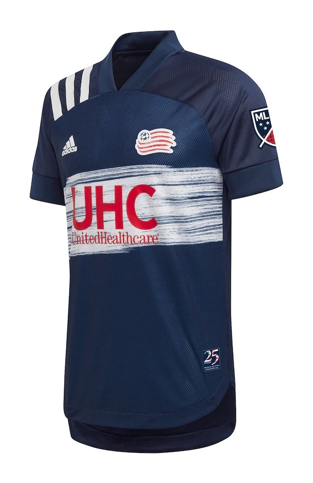
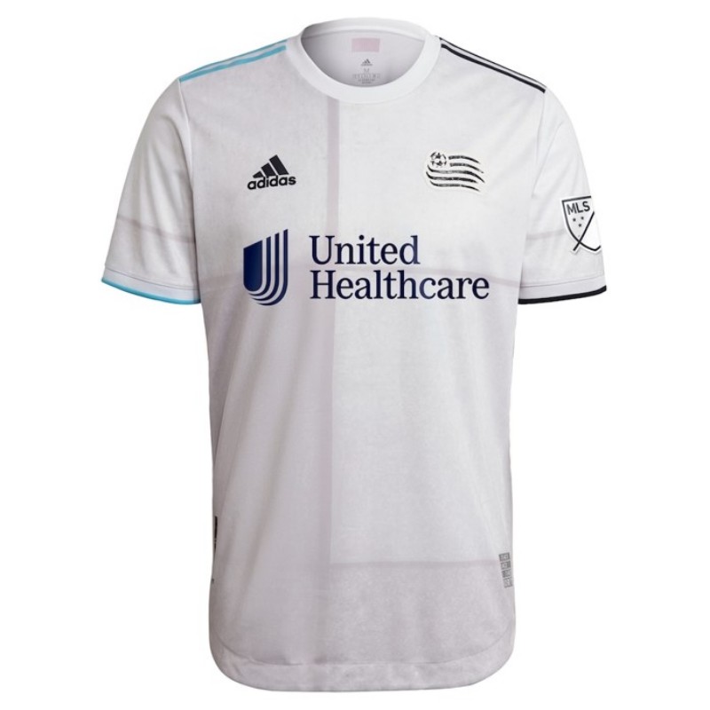
If 25 years of the New England Revolution can only give these two terrible kits, can we please skip forward another 25 years?
25. Houston Dynamo FC


While I don’t hate the first kit, the second one makes me want to throw up my lunch.
24. Nashville SC


These jerseys are as uninteresting and boring as the actual soccer Nashville SC plays.
23. San Jose Earthquakes

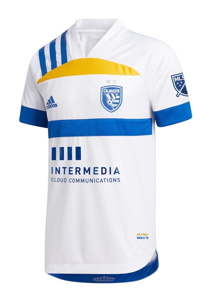
The first kit is just alright, but I really don’t enjoy the second one. It still looks like a duckbill.
22. Los Angeles FC


These jerseys are just fine, but they’re lower just because of what they didn’t do with a great color scheme.
21. Inter Miami CF


I like these more than the previous kits, but they are even worse at not using an even better color scheme, the pink and black.
20. D.C. United


I like these jerseys but they’re still a little basic for my taste.
19. Chicago Fire FC

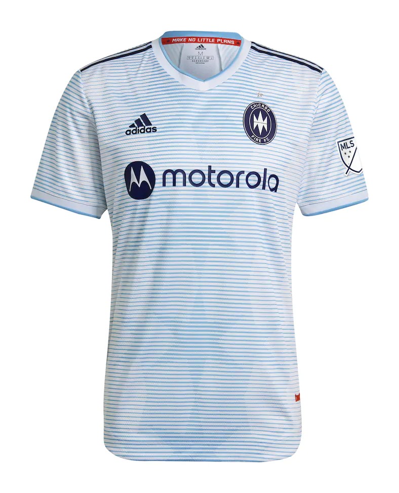
I enjoy both of these kits, but I really like the colors used in the white one.
18. FC Dallas


These kits are both pretty interesting, and I really enjoy that about them. They’re also one of the few that don’t have either a black or a white kit.
17. Portland Timbers

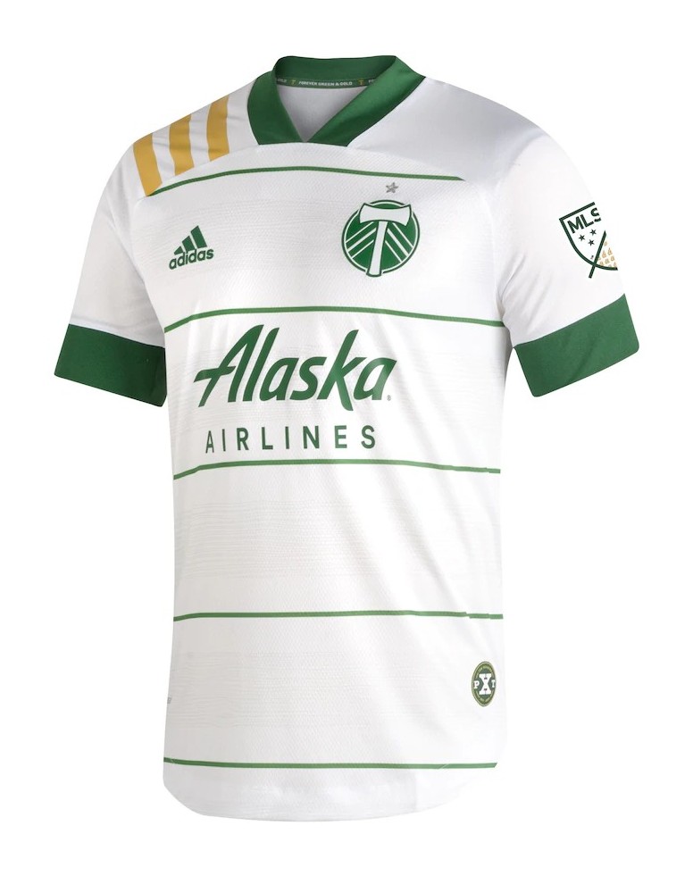
I think the first kit could be much better, but I really love the second one, boosting its ranking.
16. Real Salt Lake


I think these kits are both alright, but I really like the colors of the second one.
15. Austin FC

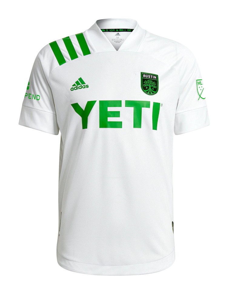
I really like both of these kits, but the second kit is unfortunately really basic.
14. LA Galaxy
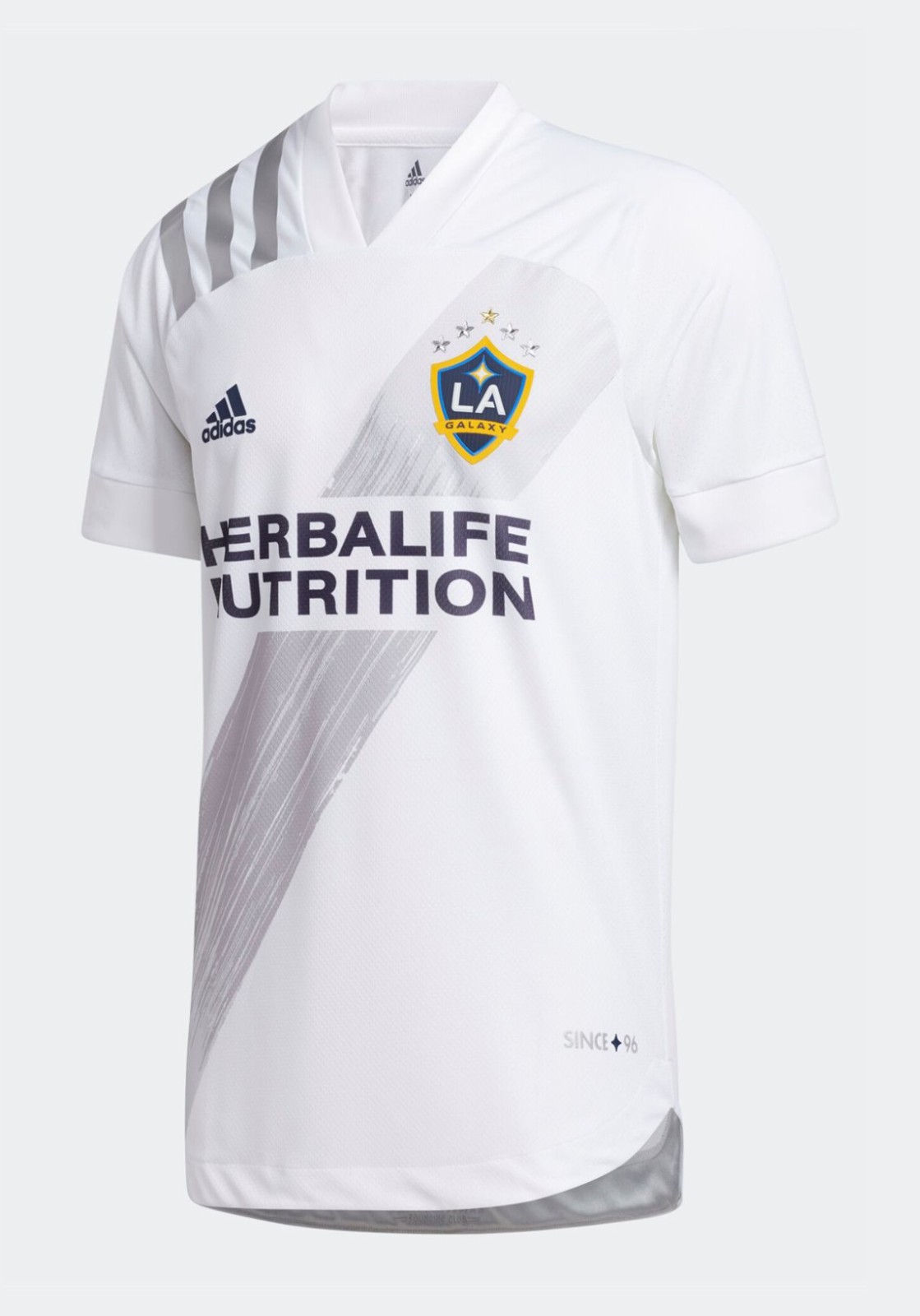
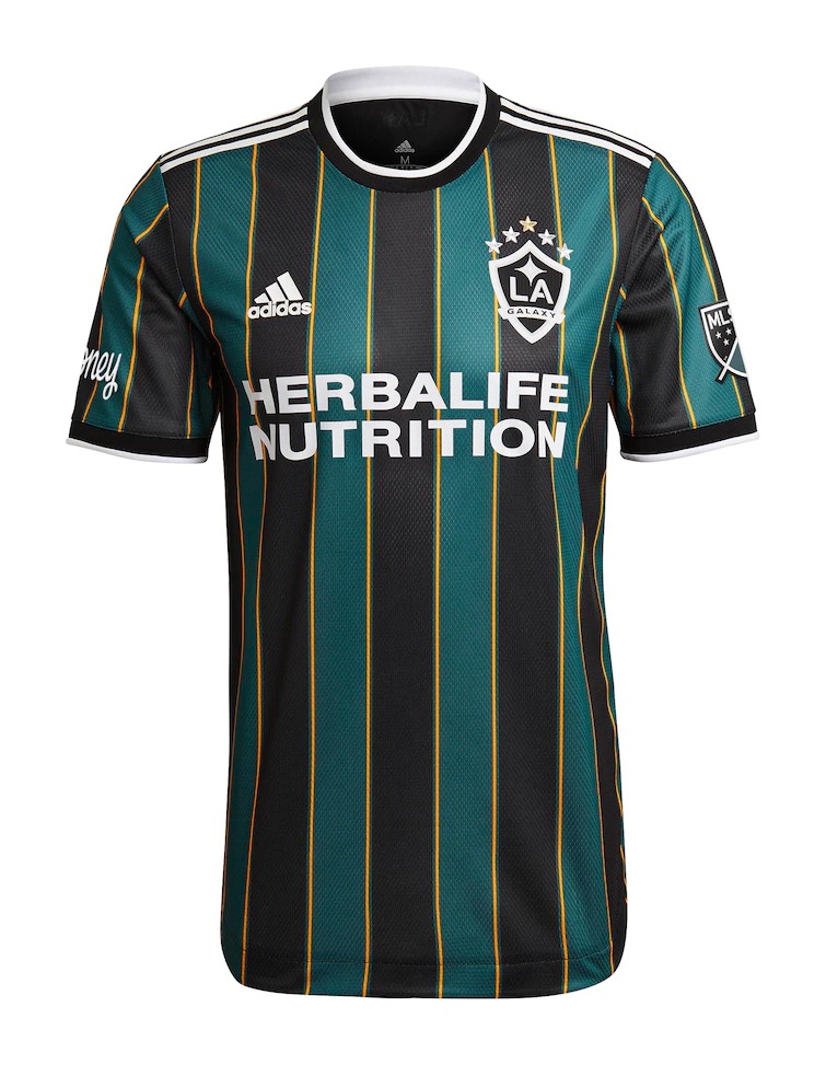
I like both of these kits a lot, and applaud the Galaxy for using a unique color scheme on one of them.
13. Atlanta United FC


I like the use of the five stripes on the home, and love the gold on the away kit, almost making up for the awesome peach kit the team used to have.
12. Minnesota United FC

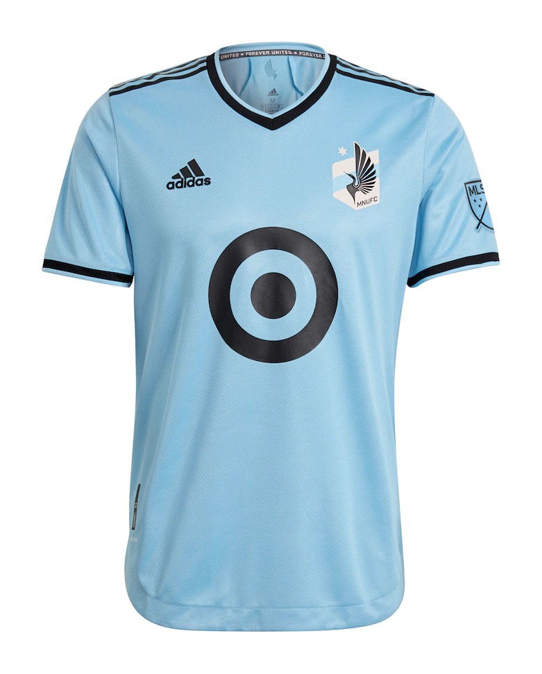
I like the use of the logo in the first kit, as well as the coloring of the second.
11. Philadelphia Union


I like both of these kits, but I really like the unique look of the second kit. I’d love to see more teams try something new like this.
10. New York Red Bulls
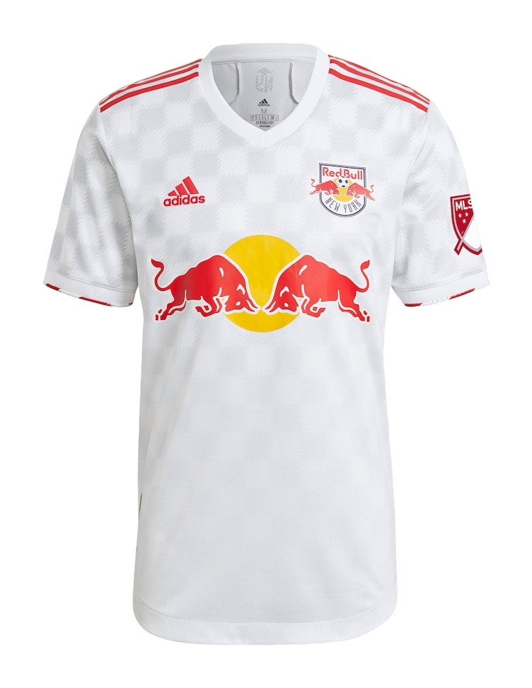
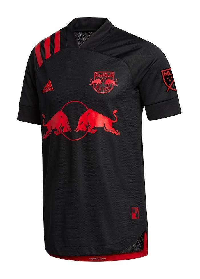
The Red Bulls still have the best kit in MLS, boosting its ranking higher than it really deserves with the first kit.
9. Sporting Kansas City

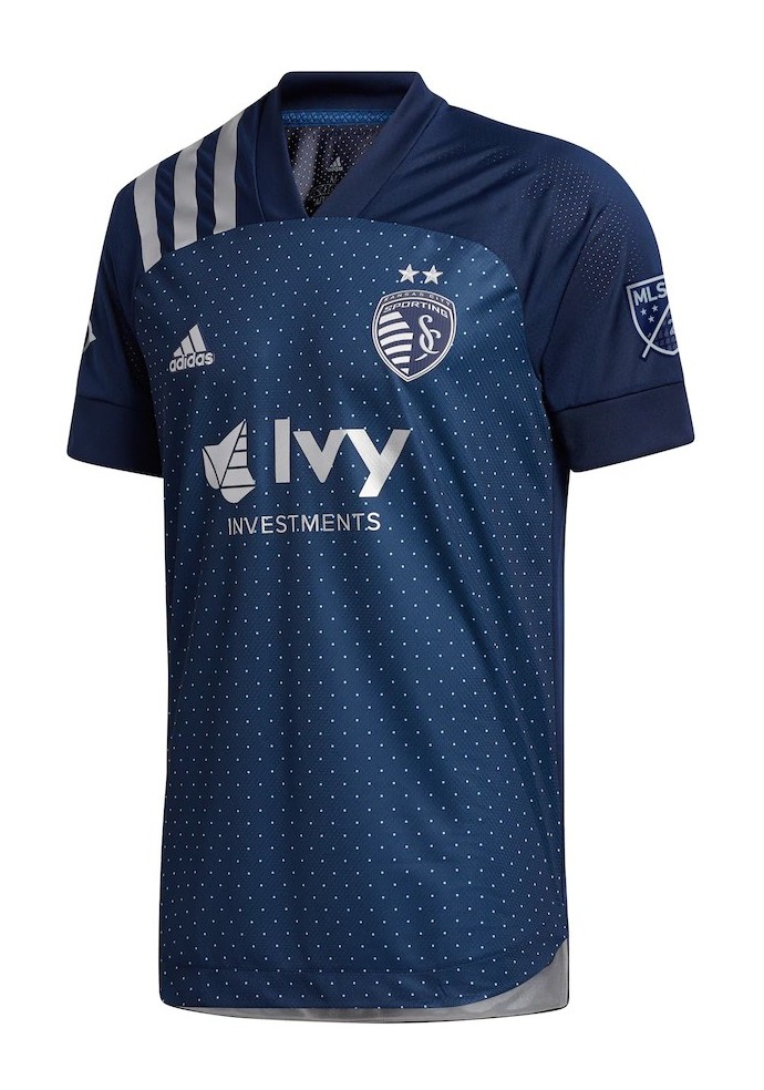
I like both of these. They’re relatively different and look good next to each other.
8. CF Montréal

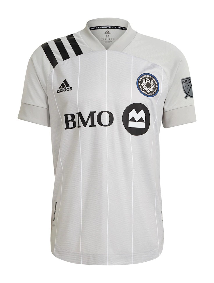
I like both of these, especially the first one with the team’s logo on the background.
7. Orlando City SC

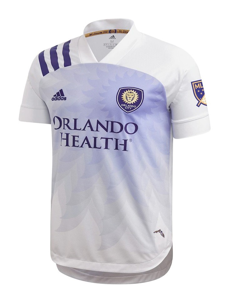
I enjoy both kits, but I still really like the away kit with the way the logo is used.
6. Toronto FC

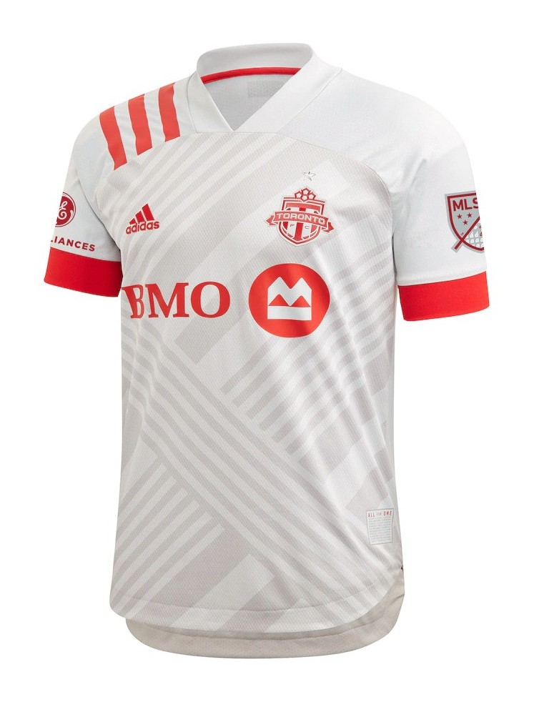
I love the different shapes and lines on both of these kits. They make them look very unique to others in the league.
5. Vancouver Whitecaps FC

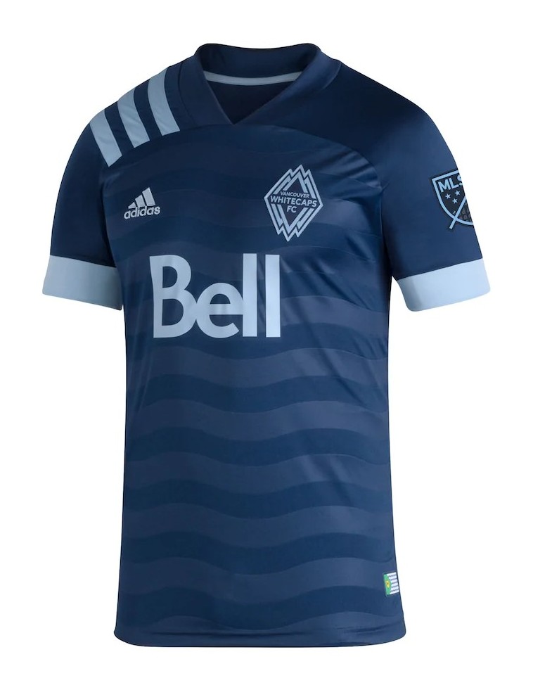
While these may look very basic, I think they work very well and are helped by the color scheme and its use of lines.
4. Colorado Rapids

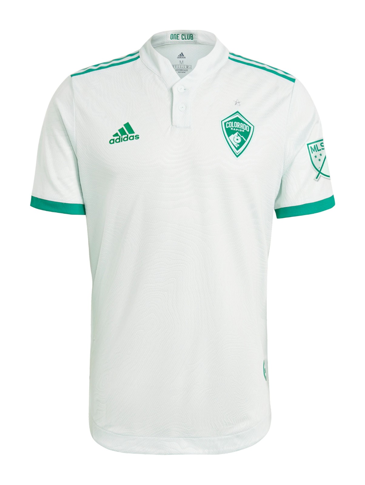
I absolutely adore the colors in both of these kits. The primary is great, but I really love the away kit and its coloring.
3. New York City FC

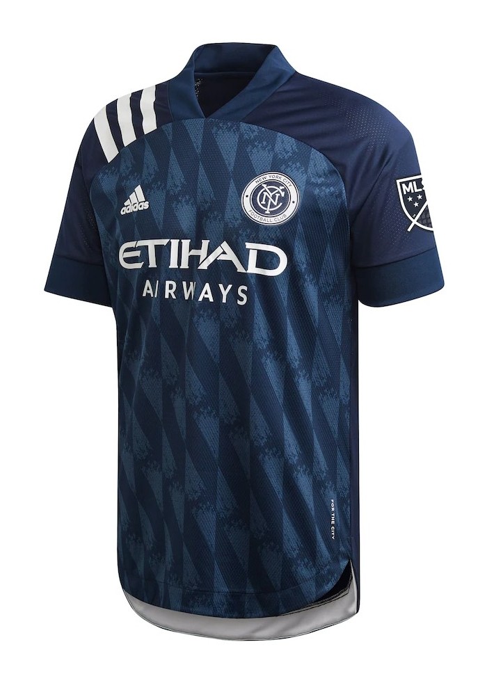
Both of these kits have a similar color to the Sporting KC kits, but I think they use the colors better than those.
2. FC Cincinnati

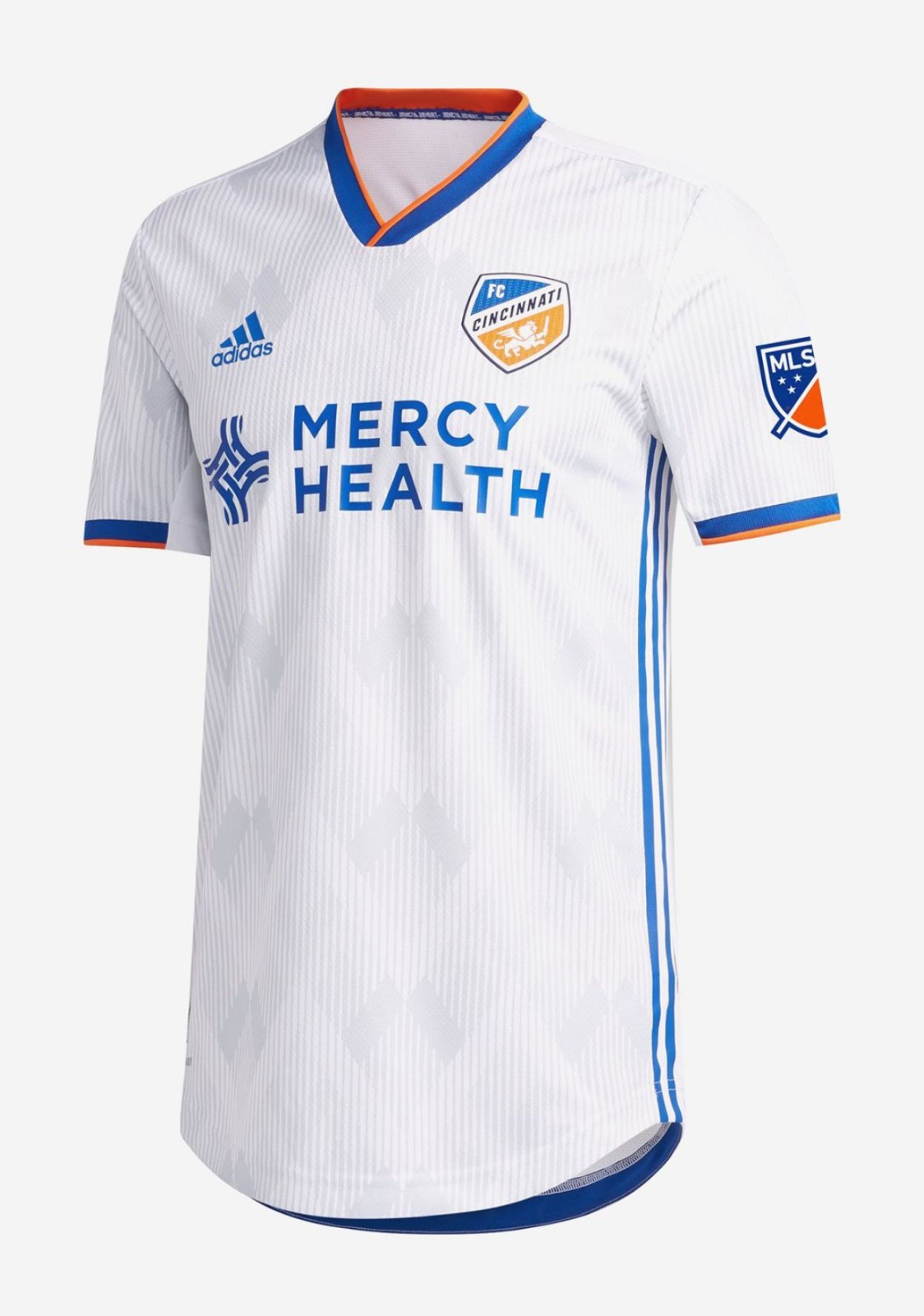
Both of FCC’s kits are pretty great. I love the striping on the new primary, as well as the side stripe on the away.
1. Seattle Sounders FC

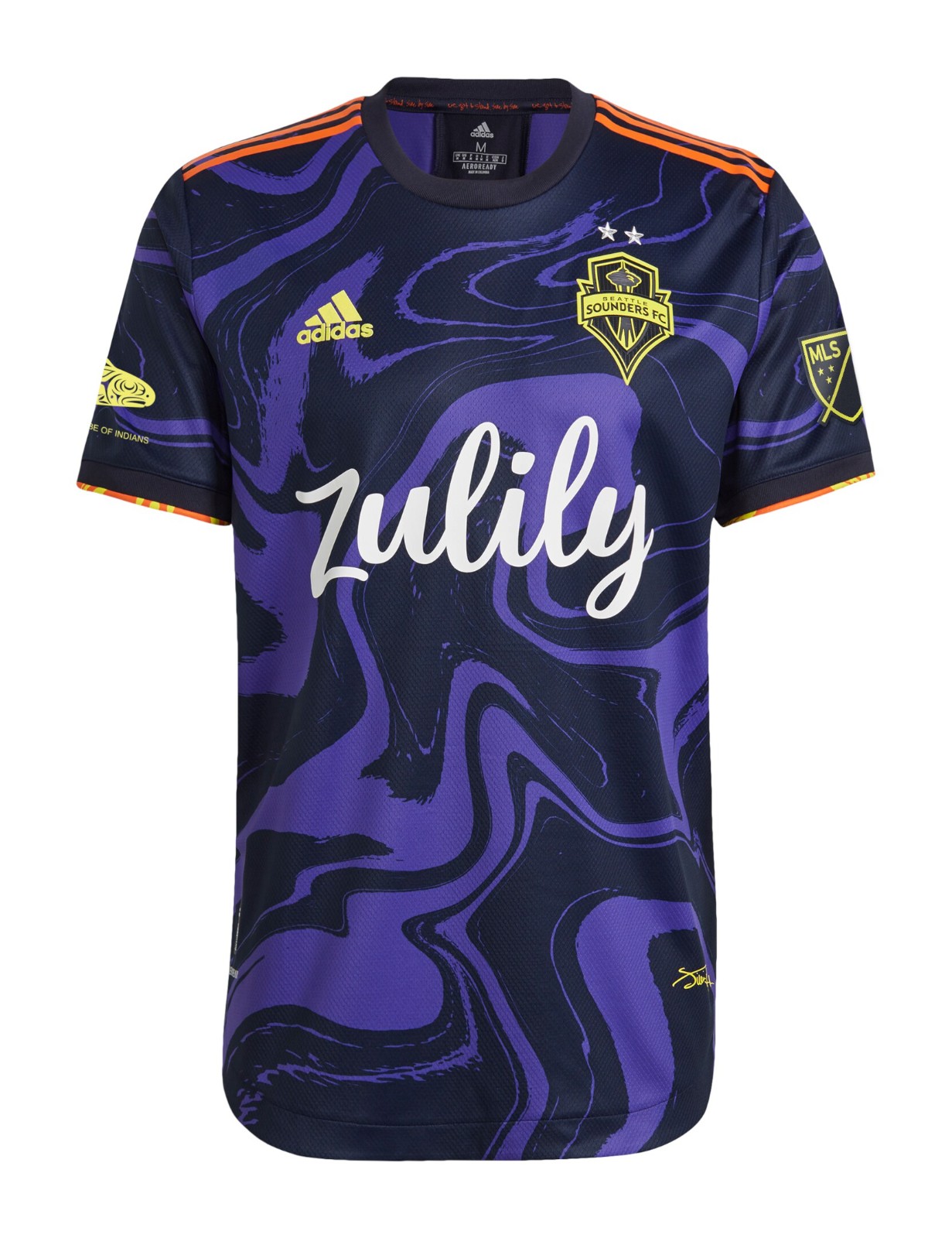
I might be raked over the coals for this, but I really like both of these. The primary is nice and I like the stripes, but I really like the unique color scheme of the away kit. I also love the gold logo usage.
Recommended for you