Hey, I’m back with another kit review, but this time it’s special! The MLS released a whole line of kits for the 25th anniversary of the league, and because I love making lists, that means I’ll be making one ranking them from the worst to the best. All the pictures of the kits are from the MLS website.
25. New England Revolution: The Original

This is the worst of the bunch. I do not like the weird way they tried to mimic their logo on the middle part and how it cuts the front in half. Overall, it’s the weirdest kit made for this and also doesn’t work at all.
24. FC Cincinnati: The BOLD Kit

While I am not as down on as this kit as I was when it was revealed, I still don’t think it’s good, not even close. It tries to do too much on one jersey and that’s a crime.

23. Real Salt Lake

This kit is just nauseating to look at. I feel like I am being hypnotized while looking at the middle part, and maybe Real Salt Lake will use it to hypnotize their teams into thinking they’re not playing a soccer match at the moment.
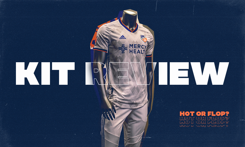
22. Houston Dynamo: HTX 15 KIT

This kit is almost exactly the same as the Real Salt Lake kit. It’s only higher because I love the black and orange color scheme.
21. Seattle Sounders: Forever Green

Seattle has consistently had some of the best kits in MLS, so it’s funny they have one of the worst in this line. I don’t think it’s absolutely terrible, but as our own Clay Winstead mentioned, it looks like a watermelon and now I can’t unsee it.
20. D.C. United

D.C. United’s kit isn’t bad, it’s just really boring. There’s nothing unique or different about it, and I really don’t like that on this one.
19. San Jose Earthquakes: 408 Edition

I think this kit is alright except for the fact that I can’t look at this kit without thinking the yellow part on the top of it looks like the bill of a duck. Sorry but that’s in your head now too. You have to live with that like I do.
18. FC Dallas: The Legacy EQT

Similar to the D.C. United kit, I think this kit is alright but it’s a little uninspired. I also think it just looks awkward having the stripes get bigger and bigger as they move down the kit.
17. Nashville SC: Nashville Vibe

This kit is exactly like the kit as D.C. United in that there is nothing interesting going on with it. The only thing saving it is the interesting color scheme Nashville using on it.
16. Los Angeles FC

I feel like I’ve been saying the same thing for the last few kits and that is they’re just boring. LAFC makes me the angriest with that because their color scheme of black and gold could be so amazing but the all-black kit just doesn’t utilize that as it could.
15. LA Galaxy: 25th season celebration Kit

I think the way it uses the sash is interesting and I like how they went with the silver instead of blue like the Galaxy usually do, but I don’t like how the Adidas stripes and the sash are on the opposite sides. I think it would have been really neat to have them match up.
14. Inter Miami CF: The Inaugural Away Kit

Inter Miami has one of the best color schemes in the MLS, but the fact that this is all they could muster with that shows that they really weren’t given enough time to make something truly unique.
13. Montreal Impact

I really enjoy the muted nature of this kit. The black works well with the white stripes on the front of the kit.
12. Colorado Rapids: The Nine Six Kit

I love the Rapids color scheme, and it really works well here. The Adidas stripe is noticeable, but thanks to the baby blue it isn’t too noticeable. I also like the darker diagonal stripes.
11. Philadelphia Union: Forever Faithful Kit

I love the gold Adidas stripes on the shoulder, and I think the muted snake on the front part of the kit is unique and interesting.
10. Columbus Crew SC: The New Heritage Kit

I have always loved the Columbus Crew kits, and while this one doesn’t live up to the hype of some of their past ones, it is still pretty good. I like the unique front panel even though it does look a little too much like TV static.
9. Toronto FC: The TFC Unity Kit

I like the way this kit uses its color. The red really stands out thanks to the rest of the kit being white, while the grey striping on the kit is one we haven’t seen used a lot.
8. Orlando City SC: Heart and Sol kit

I really enjoy this one. I like how the lion logo gets expanded out multiple times to really make sure we understand the idea. I also love their color scheme so that helps as well.
7. Atlanta United: The King’s Kit

Similar to a lot of the other white kits, I like how they give the other colors the spotlight. I also like how the five stripes are still on the kit even though they aren’t noticeable thanks to the lack of color on them.
6. New York City FC: Gotham Kit

I love the unique pattern on the front of this one and the blue used with the white Adidas stripe. I think this one works really well.
5. Minnesota United: The Wing Kit

I really do like this kit. I love how the wing is on the front of the kit and the use of the blue on the Adidas stripe.
4. Vancouver Whitecaps: The Wave jersey

I adore this kit. I love the waves on the front, like, I love it. The use of blue is also great. I love how it’s on the cuffs and the stripe. It’s one of the only kits to use two colors to perfection.
3. Sporting Kansas City: Swiss Dots Kit

I don’t know why but I really enjoy this one. I love the dotting on the front part of the kit and the whitish-silver of the typing.
2. Portland Timbers

While this may be one of the most basic of the kits, I think it works amazingly well. I love the striping on the front part of the kit and how the cuffs are also green, but I adore the Adidas stripe being yellow. It utilizes the color scheme of the Timbers perfectly.
1. New York Red Bulls: Dark Mode

This is one of the greatest kits I have ever seen. It’s perfect. Maybe it’s because I love black-out kits but I think there is literally nothing wrong with it. I have literally thought about purchasing one of these because of its perfection. This is the kit I will look at when I wonder if the MLS can ever make a good kit, and I’ll know they can. This makes me wonder how they can make something as stellar as this but then give us a kit like the Revolution or Cincinnati.
Recommended for you