Photo Credit: Jeremy Miller
FC Cincinnati enters its new league with a new identity.
In what is considered its official launch into MLS as the 24th team to play in 2019, the club unveiled a new logo, name and slogan Monday at a private event at Woodward Theater, the same venue where MLS commissioner Don Garber hosted a town hall event on Nov. 29, 2016 — exactly 18 months before the expansion announcement. The first renderings of the club’s soccer-specific stadium were also made public here.
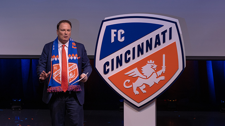
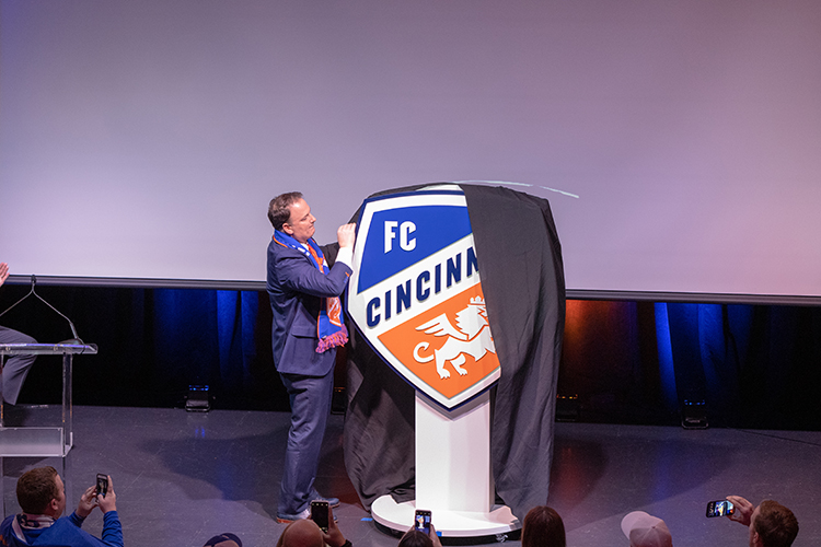
Monday’s highlight was the unveiling of the new crest. Accompanied by streaming confetti, FC Cincinnati president and general manager Jeff Berding removed the cover on stage to reveal the logo, matching the one leaked on social media.
“With our MLS brand, we wanted to cement our place in the region’s sports landscape for generations to come,” FC Cincinnati majority owner Carl Lindner III said. “We’re so proud of the crest that we’ve built. It will represent our great city of Cincinnati regionally, nationally and will further our city’s presence on the world’s stage also.”
The crest is a collaboration of supporters, the club’s fan council and Interbrand, a leading global branding agency. Interbrand’s project leaders on the crest, Jamey Wagner and Ryan Brazelton, are Cincinnati natives.
“We knew that we were going to be an orange and blue brand,” Wagner said. “We weren’t walking away from that. But we also wanted to bring some prominence to the word ‘Cincinnati’ for color.”
In navy blue type and capital letters, “CINCINNATI” runs diagonally across the new crest. Above it is “FC” against a blue background. A winged lion wearing a crown and brandishing a knife is still prominent — but decidedly different from the club’s original lion — below with an orange background.
Berding said the club received several different crest ideas, but they were dramatically different — eliminating the lion and changing shapes. Berding said the council preferred to keep the lion, but the new version “looks a little meaner, a little stronger. It looks like the king of the jungle,” he said.
“We landed in a place that we’re very happy with,” Berding said. “We were pretty partial to our original. We decided before we even started that it was going to be an evolutionary change, not a revolutionary change.”
Said Lindner: “I loved our old logo, but this is a great evolution, and it’s even a better representation of who we are. If you study every little detail of this logo, we had so many great ideas from Interbrand, our supporters — when you bring all those things together, we have a logo that has so many unique features and meaningful features to Cincinnati and to who we are that makes it different than any other logo out there.”
Key features of the logo:
- The shape of the crest resembles various architecture of the West End, site of the new stadium, and also a panel on a soccer ball.
- Three points on the lion’s wings for the three years it took the club to get to MLS.
- The wings represent a rising city in a rising sport.
- Seven points in the mane for Cincinnati’s seven hills.
- The “C” in the tail is for Cincinnati.
- The lion’s crown carries over from the original crest and signifies the crown for the Queen City.
- The lettering has hints of German typography.
The eye goes immediately to the word “Cincinnati” in the middle.
“We looked at all the other marks in Major League Soccer, and none of them had the city name quite so boldly proclaimed,” Berding said. “When we started the club, FC Cincinnati was the name we chose because we wanted to be all about Cincinnati. So when you see the scrawl on ESPN … for us, they have to say Cincinnati.”
The logo isn’t the only thing that’s new for the inaugural MLS season.
Futbol Club Cincinnati is no more. The formal, legal name of the club as a business is now Fussball Club Cincinnati. And on the pitch, the team will be called Football Club Cincinnati.
There’s also a new slogan, which Lindner broke in as he proposed a toast to “ignite and unite Cincinnati.”
Lindner also paid homage to the city’s two other major pro sports franchises, noting the Bengals played their 50th season last year, and the Reds will turn 150 in 2019.
“I like being the newest kid on the block,” he said.
The club will take its new crest on an “Ignite and Unite” tour of Cincinnati this week with stops at Fountain Square, the zoo, the Banks and Laurel Playground.
Fans can see a life-sized crest at the stops, and the first five fans at each stop can win FC Cincinnati MLS products.
Stops and times are:
- Tuesday at Fountain Square, 11:30 a.m.-1:30 p.m.
- Wednesday at Cincinnati Zoo, 11 a.m.-1 p.m.
- Thursday at The Banks (Anderson Pavilion and Carousel), 11:30 a.m.-1:30 p.m.
- Friday at Findlay Market, 11:30 a.m.-1:30 p.m. and Laurel Playground, 3-5 p.m.
With the pomp and circumstance of the rebrand now complete, FC Cincinnati must continue its business of constructing an MLS roster. A few important dates are on the horizon, beginning with the half-day transfer window on Dec. 9 and the expansion draft on Dec. 11.
Groundbreaking on the new West End stadium will be on Dec. 18.
Though he’d been working on transitioning to MLS on the pitch for a while now, FC Cincinnati coach Alan Koch acknowledged Monday’s events made things feel a little more real.
After a trip to Europe, Koch said he will go overseas again this week to a different continent and possibly a third continent after that.
“To be quite honest, I haven’t celebrated anything during the course of this year,” Koch said. “It’s non-stop. It’s a grind, and we’ve gladly embraced that grind. Tonight I’ve got a beer in my hand. I’m going to be working very, very hard (Tuesday). But I’m going to enjoy tonight.”


