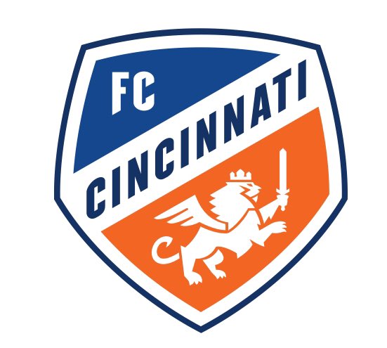
FC Cincinnati’s new rumored logo has leaked from a couple places but most credibly from MLSStore.com. An official FCC reveal will be covered by Cincinnati Soccer Talk this Monday, 6 P.M at the Woodward Theater. Nothing is final until then so an open mind is a good thing in these types of situations. Do not be shocked if something was to change between a rumor Friday and a finished product on Monday. However, the logo above has been passed around enough, that we feel it is worth a discussion. CST reached out to the fans and staff to get reactions on the potential new design.
Q: A FC Cincinnati logo has leaked from a couple places but most credibly on mlsstore.com. Though not official, odds are we are starting to get an idea of the final product. Did FC Cincinnati hit or miss the mark on the rumored crest?
Trisha Houser
My first thought when I saw the leaked “logo” was, “well, it could always be worse.” We’ve seen some bad logos in our day. I’ll admit that throughout the whole expansion process, I didn’t really put much thought into it, so I don’t have strong feelings one way or the other. I like that the design is simple, nothing too flashy or intricate. At the end of the day, it’ll grow on people. Not everyone is going to love it, but it’s not going to stop the supporters from going to matches or buying merchandise. And the best part about the logo is that it’s not set in stone; the probability of it changing within a couple of years is high, so there’s no reason to sweat it.
Bill Wolf
I had the privilege of sitting on a panel that was shown some earlier designs. My one takeaway from that meeting was that FCC had a near impossible task. For any design element, the group seemed to split evenly in favor of (must have, love it), against (please don’t, hate it) or indifferent to. Diamond, Wavy lines, Knifely Lion, Wings on Lion, Crown, Use of the number 7 to represent the 7 hills, etc. The branding was either going to be revolutionary, cutting ties and making a big statement or it was going to be evolutionary and give homage to the club’s existing branding. I would actually prefer bold and revolutionary, but let’s be honest. Bold and revolutionary would probably excite a segment of the fan base but would upset the rest. Otherwise, would it really be bold? It was obvious from the early designs that the club was looking to be more conservative and take a safer path. Was this ever going to excite me? Probably not, but I can respect it, understand it and appreciate it. I like the simpler lines. I like the clearer blue and orange and hope that this means we don’t look red on television anymore. I like that CINCINNATI is bold and in your face and legible even on a small version of the badge. And mostly I like that the new lion is a four-footed beast instead of a two-footed character. I appreciate that we move forward into the future with MLS but remember our past in the USL. Did I want to be “wowed?” Absolutely. But I don’t hate this. I’m mildly pleased, and I find I like it more as I process it and consider it. And to be honest, I never really spent much time thinking about our existing branding. I wore the “knifey lion” with pride because it was the badge of the club that I loved. I will wear this badge with honor as well.
Seubs
I saw this logo a few days ago and immediately cringed in disgust. I’ve had a few days to let it sink in. I’ve seen this logo in a digital format alongside other MLS logos, and to be honest, it’s not GREAT. I’m not saying it’s bad, because I’ve seen worse logos in sports. I think as a fanbase a lot of us were expecting Cincy to hit it out of the park with their new MLS branding, especially with the money they have invested in it since Interbrand was involved. This was always going to be a difficult sell. I’m also the guy who hated the black kits, who didn’t really like the 2018 kits when they were first launched. But, much like the 2018 kits I ultimately warmed to them. I’ll be honest, I am warming up to the logo. Is it great? No. Will it change in a few years? Probably.
Jeremy Miller
Is it real? Maybe, maybe not, but if it is it will be controversial for less than an hour until outsiders start trashing it, at that point, we will all love it, “no-one likes us and that’s ok”. Personally, I like it, I feel like it fits in with the rest of the league while still standing out. Importantly, it reduces the footprint of the “FC” when compared to the previous one. The darker blue is going to look fantastic on shirts and jerseys. I do feel they missed out on incorporating the city more than just enlarging the word Cincinnati.
Boston Brazzell
Why do soccer fans think a logo needs to scream history and tradition? The Bengals are 50 years old and have a striped B. The historic Green Bay Packers have the letter G. FC Cincinnati is not a historic team and the logo does not need to be a famous painting that draws our 100 different meanings. A logo needs to be an icon that tells the viewer what it is and what it stands for. The mission has been accomplished. Could it look better? Of course, it could and I believe it is only the first of many iterations in the many years to come. Don’t like the way this one turns out, support the team and maybe the designers will hit a different personal style five to ten years from now.
Recommended for you