Each year I review FCC’s kit and make my judgment. They can’t all be good and they can’t all be bad. FC Cincinnati recently revealed the new River Kit Wednesday morning, which is scheduled to be the replacement kit for one of the team’s better kits in my opinion.

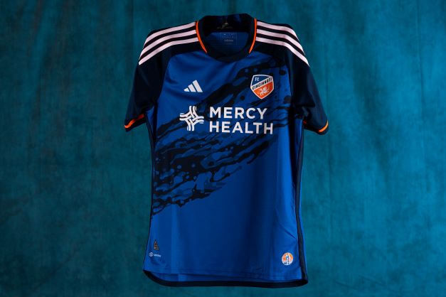
Photo provided by FC Cincinnati’s Communications team showing the front of the team’s new River Kit.
FCC has tried to do something new with this River Kit as the club calls it. Is it a worthy replacement or does it leave something to be desired?
Now, this is just my opinion, but I feel this new addition to the club’s closet is a disappointment compared to one of its best.
The most noticeable and important aspect of the kit is the river motif in the center of it. This isn’t a terrible concept, and I can see what the design team was going for, but I don’t feel it was executed well. The idea of it is to look like a river, obviously, but it instead looks like someone spilled some water on a blank blue kit. This is the most disappointing part of it for me. This aspect of the kit was probably the biggest part of if it was a good design or not, and I don’t think it was executed well enough.
Onto the other aspects of the front of the kit, I do really like the stripes on the shoulders. I think the small orange accents around the stripes are a nice touch and I like them being straight white.
However, I also think it continues to be weird how the team can’t decide if it wants its blue shade to be navy or royal, and that continually shows up in its designs.
For the sleeves, I also really enjoy the orange stripe and think it looks nice.

Photo provided by FC Cincinnati’s Communications team showing Brandon Vazquez as well as the back of the new River Kit.
Concerning the back of the kit, I really really like the Cincinnati script at the collar. I believe it looks good enough to even possibly be used in a future rebrand. It’s that good. I love how some of the letters connect to the underline and how the wording is very well-defined. Overall, this is my favorite aspect of the whole kit. Please continue to use this in as much FCC content as possible.
The only other thing of note for the back of the kit is the … interesting way the two shades of blue connect to each other. It goes from the Cincinnati script into a weird inverse V and then into the rest of the kit. I do think I might just be nitpicking here, but I do find this to be odd and too weird to not mention.
Overall, this kit is a disappointment for me and it is unfortunate to see it for the next two seasons.


Each year I review FCC’s kit and make my judgment. They can’t all be good and they can’t all be bad. FC Cincinnati recently revealed the new River Kit Wednesday morning, which is scheduled to be the replacement kit for one of the team’s better kits in my opinion.
Photo provided by FC Cincinnati’s Communications team showing the front of the team’s new River Kit.
FCC has tried to do something new with this River Kit as the club calls it. Is it a worthy replacement or does it leave something to be desired?
Now, this is just my opinion, but I feel this new addition to the club’s closet is a disappointment compared to one of its best.
The most noticeable and important aspect of the kit is the river motif in the center of it. This isn’t a terrible concept, and I can see what the design team was going for, but I don’t feel it was executed well. The idea of it is to look like a river, obviously, but it instead looks like someone spilled some water on a blank blue kit. This is the most disappointing part of it for me. This aspect of the kit was probably the biggest part of if it was a good design or not, and I don’t think it was executed well enough.
Onto the other aspects of the front of the kit, I do really like the stripes on the shoulders. I think the small orange accents around the stripes are a nice touch and I like them being straight white.
However, I also think it continues to be weird how the team can’t decide if it wants its blue shade to be navy or royal, and that continually shows up in its designs.
For the sleeves, I also really enjoy the orange stripe and think it looks nice.
Photo provided by FC Cincinnati’s Communications team showing Brandon Vazquez as well as the back of the new River Kit.
Concerning the back of the kit, I really really like the Cincinnati script at the collar. I believe it looks good enough to even possibly be used in a future rebrand. It’s that good. I love how some of the letters connect to the underline and how the wording is very well-defined. Overall, this is my favorite aspect of the whole kit. Please continue to use this in as much FCC content as possible.
The only other thing of note for the back of the kit is the … interesting way the two shades of blue connect to each other. It goes from the Cincinnati script into a weird inverse V and then into the rest of the kit. I do think I might just be nitpicking here, but I do find this to be odd and too weird to not mention.
Overall, this kit is a disappointment for me and it is unfortunate to see it for the next two seasons.
Recommended for you