Hey all! It’s Jacob Clary, your resident kit aficionado ready to look at another new FC Cincinnati kit. Thankfully, we only have one kit to review and that is the Heritage Link kit FCC has been teasing for the past couple weeks and finally revealed Tuesday.
First, I’m going to embed the video FC Cincinnati posted showing off the kit so you can see it for yourself.
3…2…1…liftoff! 🚀 #FCCincy pic.twitter.com/6WmVNdSiz3
— FC Cincinnati (@fccincinnati) December 3, 2019
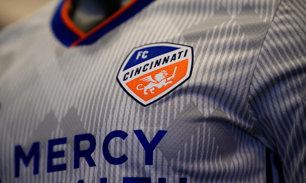
So, now that you have seen the kit, I am going to go over all of its parts in detail. The first thing to catch the eye is the grey diamond design. Our own Bryan Weigel already concluded that it is basically Bayern Munich’s primary kit design, but white. However, that isn’t really a bad thing. I like the grey because at least there’s something on the white this time, and it’s not just a white shirt. As you can see below, the grey diamonding isn’t too noticeable, which I find kind of disappointing. It could have worked really well on a blue primary with possible orange diamonds, but overall I like it.
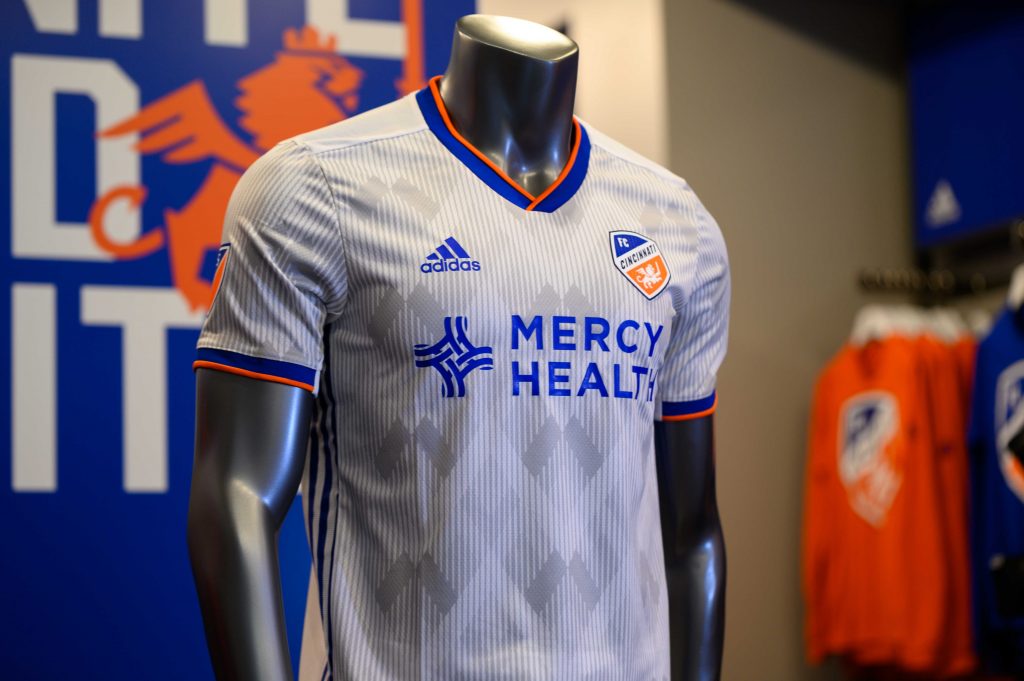
Photo by Jeremy Miller.
The next thing about the kit I really enjoy is the collar and sleeve bottom. The blue with orange on the outside looks really nice and makes them pop. I think it also looks much better this year compared to last year because the words are also blue. Last year I didn’t like how the wording was black but the collar and sleeve bottoms were blue. It makes the few spaces where there actually is color look much better because it matches the others. On the collar is also the wording “Juncta Juvant,” which I really enjoy. I love when kits have wording making it feel even more homemade. Also, something I like is the lion on the top of the back. I think it’s a neat addition to the kit and one I welcome.
Another welcome change is the blue trim on the side of the kit. I love the way blue is actually used on the away kit this year. Seen from the side, it meshes well with the other aspects of the kit, like the wording and the collar.
Overall, this white kit is miles ahead of last year’s. I like the changes it made to look different from a lot of other white kits, and it feels unique enough compared to the Bayern template it looked to have emulated. It’s one of the better FC Cincinnati kits but for me doesn’t reach the heights of the 2019 primary or the Black USL alternate.
Recommended for you